Data visualization guide
The Query Builder offers various options for displaying your results depending on your analytical needs. These visualizations help you transform raw data into actionable insights for reporting and threat hunting.
The query builder offers six visualization options, grouped into two categories:
- Total values: Focuses on comparing values across different categories at a specific point in time.
- Time series: Highlights how data evolves over time, enabling the analysis of trends and changes.
Total values
Number
The Number visualization prominently displays a single numeric value, making it perfect for showcasing key performance indicators (KPIs) or other important metrics.
Requirement
To use the Number visualization, your query must result in only one numerical value. It cannot be used if the query returns multiple values.
Table
The Table view provides a comprehensive display of raw numerical values for each category across the entire date range. This format allows for direct comparison of total values across different categories.
Row Limit
Currently, the maximum number of rows that can be processed in the Table view is 10,000.
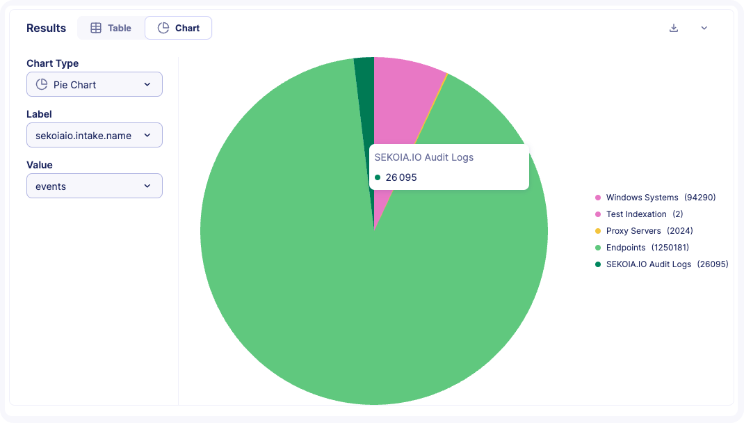
Pie Chart
The Pie Chart visualization illustrates how a total amount is divided among distinct groups.
Number of value allowed
To ensure clarity, the maximum number of values allowed in a pie chart is limited to 40.
Configuration:
- In the Label field, select the column to use for labeling each section.
- In the Value field, select the column representing the numerical value.
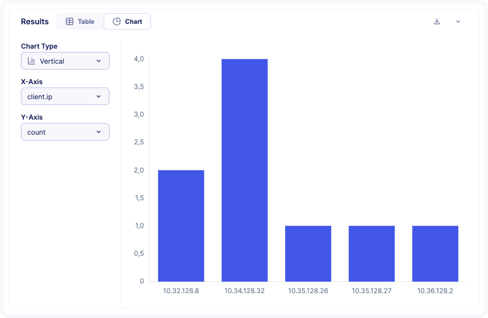
Bar Chart
The Vertical Bar Chart allows you to compare values across different groups effectively.
Number of value allowed
To ensure a clear display, the maximum number of values allowed is limited to 80.
Configuration: * In the X-axis, select the column to use for grouping (any data type). * In the Y-axis, select the column representing numeric values (numeric data only).
Time series visualizations
Column Chart
The Column Chart provides a clear way to compare values across different categories. This visualization is particularly useful for displaying total values side by side.
Number of categories allowed
The maximum number of categories allowed is limited to 80.
Configuration:
- In the X-axis, select the column for categories.
- In the Y-axis, select the column containing numeric data.
Line Chart
The Line Chart is designed to visualize data points over a continuous range, making it ideal for displaying trends over time.
Number of data points allowed
To ensure clarity, the maximum number of data points allowed is limited to 200.
Configuration:
- In the X-axis, select the column for the time or continuous variable.
- In the Y-axis, select the column containing numeric data.
Advanced display options
Breakdown by
The Breakdown By feature allows you to analyze data in more depth across Bar Charts, Column Charts, and Line Charts. When you include a GROUP BY clause in your query, you can use this feature to visualize how different categories or values contribute to the overall dataset.
Group mode
The Group Mode feature is available for Bar Charts and Column Charts, offering two display options:
- Stacked Mode: This mode stacks the values of each subgroup into a single bar, showing the total value and individual subgroup contributions.
- Grouped Mode: Bars for each subgroup are displayed side by side within each category, making it easier to compare values between subgroups.
Warning
Due to the important amount of logs ingested, the Query Builder has rate limits to protect the platform's health.
There are 3 rate limits:
- Maximum number of processed rows: At the moment the maximum value is 10 000.
- Maximum number of query: 10 query executions are allowed per minute.
- Query timeout: A query will timeout automatically after 10 minutes.
About the maximum number of processed rows limit, the Query Builder will display partial results in case this limit is reached.